Inclusive Design Patterns For 2026 (Google Doc + Videos)

Vitaly Friedman
20 years in UX • Senior UX Lead & Advisor @ EU Parliament • Smashing
3.5h Live Workshops (Full recording)
Accessibility isn’t a checklist. Designing inclusive experiences improves usability for everyone, reduces risk, and creates better products. We can build more resilient products, influence organizational change and make a tangible business impact of inclusive design.
So what does European Accessibility Act (EAA) mean for you? How would you design for young children and older adults? What about users with dyslexia and colour blindness? How do we test with screen reader software? What about multilingual UX and localization issues? And what should we keep in mind when designing sustainable, inclusive and privacy-friendly experiences?
In this practical 3.5h-workshop, we'll take a deep dive into UX and design guidelines, hundreds of real-life examples, best practices, and guidelines for truly accessible, inclusive, universal design. Expect to leave with a toolbox of insights and practical techniques to apply to any project!
🗃️ Google Doc → All workshop slides + Resources
🎁 Free Bonus → Designing Complex Data Tables
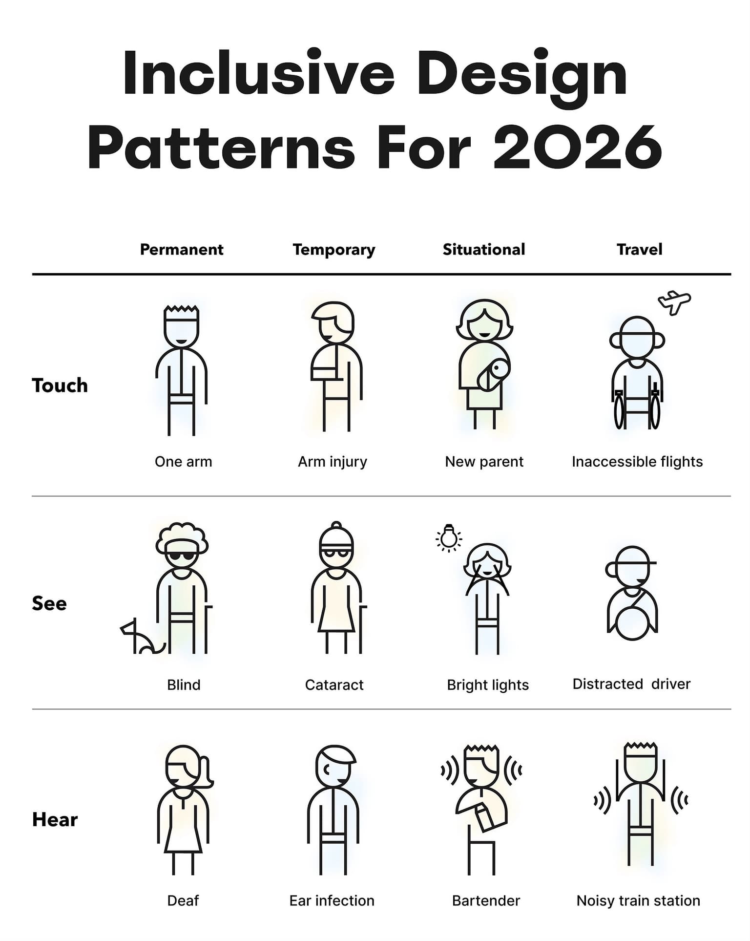
What you'll learn
Expand how you think about accessibility
Move beyond contrast and font sizes to include motion sensitivity, neurodiversity and diverse abilities.
Design for real people, not edge cases
You'll learn practical approaches for designing for left-handed users, neurodiverse users and younger and older adults.
Key takeaways
1. Companies often see accessibility as an “external edge case”.
2. They don’t realize that we all rely on accessibility all the time.
3. Eyeglasses are assistive technology, so are subtitles and zoom.
4. People are never “edge cases” and “average” users don’t exist.
5. Exceptions will occur eventually, it’s just a matter of time.
6. Accessibility is a reliable way to ensure design resilience.
7. Every person is unique, their experience is on a spectrum.
8. Accessibility overlays are a band-aid that rarely improve UX.
9. You can’t build empathy with facts, charts or legal concerns.
10. Nothing is more impactful that seeing real customers struggling.
UX guidelines
1. Blue is the safest hue for users to perceive color as you do.
2. Respect physics: map scrolling behavior to your animations.
3. Ask for consent before presenting “parallax” features.
4. For animated storytelling, add “skip to end” shortcut.
5. Drag-and-drop needs UI controls to drag with keyboard only.
6. Avoid newsletter pop-ups, feature newsletter areas instead.
7. Support spaces and copy/paste when typing into form fields.
8. Avoid complex pass requirements → suggest 2FA/passkeys.
9. Avoid superscript, use same letter size instead (1st, 2nd).
10. Rephrase fractions for understanding: 14.3% → 1 in 7 people.
11. Avoid time countdowns, time outs, sense of urgency.
12. Remind people of key events, unfinished drafts.
13. Show recent files, recently used filters/presets.
14. Guide user’s attention with Layer-Cake pattern, not F-pattern.
15. X icon is remarkably confusing, name it explicitly (Discard/Save).
16. Avoid pre-selected radio-buttons or add "None of the above".
17. Don’t assume that every deaf person can lip read well.
18. With children apps, you’re always designing for parents, too.
19. Parents value reviews from teachers, parents, doctors.
20. For teenagers, default search engine is YouTube, not Google.