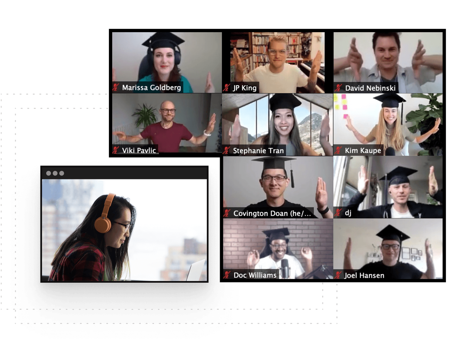
Storytelling through Data Masterclass
4 Weeks
·Cohort-based Course
Data is everywhere, but turning it into a compelling story is an art
Storytelling through Data Masterclass
4 Weeks
·Cohort-based Course
Data is everywhere, but turning it into a compelling story is an art
Course overview
Learn to blend data, design, and storytelling to create a bigger impact.
This UX-oriented course equips you with the tools and techniques to transform bland data into visually engaging narratives.
The good news is you do not need to be an Excel wizard or expert in data analytics to take this course. We will use data that is not overly complex, as the goal is to understand various types of data visualizations and how to apply storytelling. We will primarily focus on quantitative storytelling but also learn about how to effectively showcase qualitative data.
You'll gain hands-on experience through real-world examples, videos, tools, readings, and a final project where you'll apply your new skills to either real data or example data.
From knowing your audience to writing a captivating narrative to ethical considerations, this course prepares you to craft compelling stories that are grounded in data. By the end of this masterclass, you'll be able to confidently communicate data insights with powerful, visual stories.
Who is this course for
01
UX designers & researchers who want to learn how to level up data visualization skills and tell more powerful stories.
02
UX Adjacent fields. People (like product owners or product managers) who want to improve their storytelling and data visualization skills.
03
Career switchers who want to become more confident in their abilities to tell stories integrated with data.
What you’ll get out of this course
Understand the intersection of data, design, and storytelling in UX.
Give students an idea of how they can expect to grow throughout your course. Include specificity and precise results so students can benchmark exactly what they’ll learn.
Improve data analysis and visualization skills through practical exercises and course material.
Give students an idea of how they can expect to grow throughout your course. Include specificity and precise results so students can benchmark exactly what they’ll learn.
Develop strong storytelling skills targeted towards stakeholders and the core audience demographic.
Give students an idea of how they can expect to grow throughout your course. Include specificity and precise results so students can benchmark exactly what they’ll learn.
Present data-driven narratives effectively, demonstrating the ability to communicate insights in a clear and engaging manner.
Give students an idea of how they can expect to grow throughout your course. Include specificity and precise results so students can benchmark exactly what they’ll learn.
Utilize color theory, typography, layout, and design principles to create effective data visualizations.
Evaluate and select appropriate data visualization tools for different types of data and (UX) storytelling needs.
Understand the ethical implications of data collection and analysis procedures and representation of findings.
What’s included

Live sessions
Learn directly from Brooklyn Witteman in a real-time, interactive format.
Lifetime access
Go back to course content and recordings whenever you need to.
Community of peers
Stay accountable and share insights with like-minded professionals.
Certificate of completion
Share your new skills with your employer or on LinkedIn.
Maven Guarantee
This course is backed by the Maven Guarantee. Students are eligible for a full refund up until the halfway point of the course.
Course syllabus
6 live sessions • 26 lessons • 6 projects
Week 1
Oct
15
Welcome to Class + Storytelling Lecture
Intro to Final Project
Foundations of Storytelling and Why it Matters in UX
Foundations of Data Collection in UX
Ethics in Data
Oct
17
Working Session 1
Academic Research Sources Spreadsheet
Week 2
Oct
22
Data Visualization & Crafting a Narrative Lecture
Foundations of Data Visualization
Data & Design Tools Spreadsheet
Crafting a Narrative with Data
Oct
24
Working Session 2
Week 3
Work on Final Projects
Oct
29
Lecture: Tools, Techniques, and Examples + Working Session 3
Data + Design Tools, Techniques, & Examples
Applying Design & UI Principles to Data Visualization
Infographic Design Tools & Tutorial Videos
Create a style guide for your visualization
Week 4
Submit Final Projects
Nov
6
Share Final Projects + Discussion
What students are saying
Meet your instructor
Brooklyn Witteman
Brooklyn Witteman
Brooklyn is a UX/UI designer and researcher currently working at, Rain Local, a company focusing on digital advertising in the banking sector. She also freelances as a graphic designer and web designer.
Brooklyn also co-runs a Meetup in the Portland, Oregon area called Rose City Techies (RCT). RCT focuses on bringing together the local tech community through education and networking style events.

Be the first to know about upcoming cohorts
Storytelling through Data Masterclass
Course schedule
4-6 hours per week
Tuesdays & Thursdays
1:00pm - 2:00pm EST
If your events are recurring and at the same time, it might be easiest to use a single line item to communicate your course schedule to students
May 7, 2022
Feel free to type out dates as your title as a way to communicate information about specific live sessions or other events.
Weekly projects
2 hours per week
Schedule items can also be used to convey commitments outside of specific time slots (like weekly projects or daily office hours).
Learning is better with cohorts
Active hands-on learning
This course builds on live workshops and hands-on projects
Interactive and project-based
You’ll be interacting with other learners through breakout rooms and project teams
Learn with a cohort of peers
Join a community of like-minded people who want to learn and grow alongside you
Frequently Asked Questions
Be the first to know about upcoming cohorts