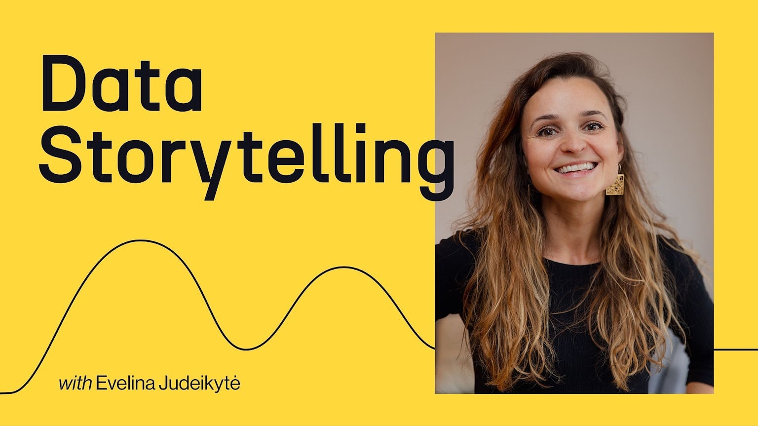
Data Storytelling Bootcamp
3 Weeks
·Cohort-based Course
Learn how to turn data into narratives that inspire action.
Data Storytelling Bootcamp
3 Weeks
·Cohort-based Course
Learn how to turn data into narratives that inspire action.
Clients include


Course overview
Go beyond chart defaults. Make data insights clear and compelling.
🙌 Learn how to structure, design, and present your data insights to inspire action and ignite change. Leverage data analysis and visualisation best practices for business impact.
🚀 Master a design process based on real-world examples to organise your storytelling workflow, save you time and increase your chances of success.
💡 Engage in interactive workshops, access dozens of templates and resources, and get valuable feedback from an international group of peers.
Take this course if you want to...
01
Transform cluttered, messy charts into beautiful and engaging designs that impress and are fast to read
02
Turn boring data presentations into clear and compelling narratives that captivate your audience
03
Become a persuasive communicator whose data insights spark action and make a difference
What you'll learn
Data insights are better understood when structured.
What is the data telling you? You'll learn how to craft a compelling message and narrative arc and apply them to both standalone charts and longer pieces (infographics, dashboards, slide decks, etc.)
Aesthetics matter.
Form follows function. You'll master the intricacies of visual perception and information hierarchy to turn your graphics into impactful story components. The methods you'll learn will work in Tableau, Power BI, Flourish, Illustrator, or any other tool of your choice.
Presenting data can be entertaining.
Just because you're presenting data, it doesn't mean you can't get creative. You'll practice a mix of strategies from Aristotle, TED, and Nancy Duarte that will transform your typical presentations into engaging data talks.
There is a method to the madness.
The process of data storytelling can feel messy and overwhelming. To guide you through the maze, you'll learn my tried-and-true design process inspired by UX design and journalism best practices.
What’s included

Live sessions
Learn directly from Evelina Judeikytė in a real-time, interactive format.
Lifetime access
Go back to course content and recordings whenever you need to.
Community of peers
Stay accountable and share insights with like-minded professionals.
Certificate of completion
Share your new skills with your employer or on LinkedIn.
Maven Guarantee
This course is backed by the Maven Guarantee. Students are eligible for a full refund up until the halfway point of the course.
Course syllabus
6 live sessions • 36 lessons • 5 projects
Week 1
Jun
3
Workshop: Finding the insights
Jun
6
Workshop: Narrative structures
#2 Craft a compelling narrative
Week 2
Jun
10
Workshop: Designing for impact
Jun
13
Workshop: Presenting effectively
#3 Leverage design for data stories
#4.1 Deliver an exceptional presentation
Week 3
Jun
17
Workshop: Adding emotion
Jun
20
Demo day!
#4.2 Deliver an exceptional presentation
Post-course
#5 Further resources
Bonus
#6 Case studies
What students are saying
What you should know about me
Evelina Judeikytė
Evelina Judeikytė
Data Storytelling & Design Expert, Founder of Parabole Studio
Hi! I'm Evelina, a data storytelling expert with a decade of experience in data and communication. Today, I run Parabole Studio — a data storytelling and design studio that helps organisations communicate their impact through engaging data stories. I've worked with clients such as Airbnb, the UN, Dior, the French Ministry of Finance, the Lancet, Vinted, and many more. I also write a popular newsletter called The Plot.
Most of all, I love teaching and interacting with data professionals from around the world. The content of this course is a unique combination of my experiences in the fields of data, design and public speaking, and I'm really excited to share it with you!
A sneak peek into my portfolio

For more, visit 🔗 parabole.studio or read 🔗 theplot.media

Course schedule
6-8 hours per week
Live workshops
Mon & Thu | 5.30pm - 7pm CET
Each session will involve an interactive lecture, practice, and Q&A. This is the core of the course, so do attend live if you can!
Live demo & feedback
Thu | 5.30pm - 7.30pm CET
This session will include demos and instructor & group feedback. It's great for asking specific questions about your work and getting into the nitty-gritty of design and storytelling.
Projects
Continuous, 4-6h
There will be async assignments for you to submit and get comments on. Use this chance to get personalised feedback from an international group of peers!
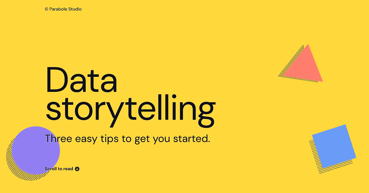
Data Storytelling Starter Kit
Get a glimpse into what you'll be learning in this course by exploring this free, introductory data storytelling resource.
Start learning
Learning is better with cohorts
Active learning
The live sessions will be based on the "learn-do" model, which means you'll get to practice the concepts as you learn them.
Peer feedback
Between each lesson, you'll have projects to submit. You'll get feedback not only from the instructor but also from an international group of peers.
Async resources
Videos, articles and templates, as well as the community space, will be available in the course page forever.